Brand Patterns
The Alterspective diagonal "A" pattern is a core brand asset that creates visual interest and directional flow. Available in 6 colors with left/right anchoring positions for flexible layouts.
Pattern Dimensions: 348 × 601 pixels (optimized for edge anchoring)
Critical Rules
Pattern Usage Rules - MUST BE FOLLOWED
PATTERN-001Patterns must be LEFT or RIGHT anchored - NEVER centered (follows LOGO-001 philosophy)COLOR-001NEVER use white text on Citrus (#ABDD65) patterns - contrast fails WCAG AAA11Y-001Minimum 4.5:1 contrast ratio required between pattern and any text overlayPATTERN-002Use dark patterns (Marine, Green, Navy) on light backgrounds; light patterns (Citrus, Pale Blue, White) on dark backgroundsPATTERN-003Maintain original 348:601 aspect ratio - do not stretch or crop the diagonal geometry
Browse by Color
Pattern Collection
Marine (#075156)
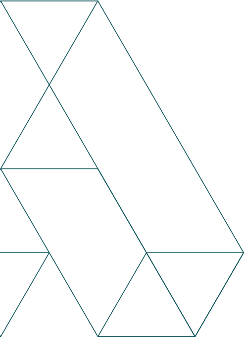
Marine Left
Ideal for left-edge anchoring on light backgrounds, hero sections, page headers
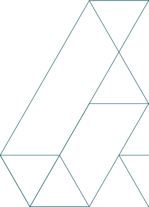
Marine Right
Ideal for right-edge anchoring on light backgrounds, sidebar accents, asymmetric layouts
Green (#2C8248)

Green Left
Success states, secondary accents, environmental/sustainability content

Green Right
Secondary sections, call-to-action backgrounds, feature highlights
Citrus (#ABDD65)

Citrus Left
Accent decoration on dark backgrounds only - NEVER use with white text

Citrus Right
Visual accents, highlighting, dark mode decorative elements
Navy (#17232D)

Navy Left
Strong contrast on light backgrounds, professional/formal contexts

Navy Right
Corporate communications, formal documentation, executive materials
Pale Blue (#E5EEEF)
Pale Blue Left
Dark mode patterns, subtle accents on navy/black backgrounds

Pale Blue Right
Dark mode layouts, night theme decorations, subtle contrast
White (#FFFFFF)
White Left
Maximum contrast on dark backgrounds, dark mode hero sections

White Right
Bold dark mode layouts, high-contrast decorative elements
Usage Guidelines
✓ Do
Use left or right anchoring to create directional flow
✗ Don't
Center the pattern - the asymmetric diagonal design is meant for edge anchoring
✓ Do
Match pattern color to background (dark patterns on light, light patterns on dark)
✗ Don't
Use Marine, Green, or Navy patterns on dark backgrounds - contrast fails
✓ Do
Use Marine or Green as primary pattern choices
✗ Don't
Overuse Citrus patterns - they are accent colors and have contrast limitations
✓ Do
Maintain the 348:601 aspect ratio when scaling
✗ Don't
Stretch, squash, or crop the pattern geometry
✓ Do
Test text overlays with contrast validators
✗ Don't
Place white text over Citrus patterns - violates COLOR-001
✓ Do
Use patterns sparingly as decorative accents
✗ Don't
Cover entire pages with patterns - they should enhance, not dominate
Implementation Examples
CSS Background Image
/* Left-anchored Marine pattern */
.hero-section {
  background-image: url('/patterns/alterspective-pattern-marine-left.svg');
  background-position: left center;
  background-repeat: no-repeat;
  background-size: auto 100%;
}

/* Right-anchored Green pattern */
.sidebar {
  background-image: url('/patterns/alterspective-pattern-green-right.svg');
  background-position: right center;
  background-repeat: no-repeat;
  background-size: auto 100%;
}
React Component
import marineLeft from './assets/patterns/alterspective-pattern-marine-left.svg';

function HeroSection() {
  return (
    <div
      style={{
        backgroundImage: `url(${marineLeft})`,
        backgroundPosition: 'left center',
        backgroundRepeat: 'no-repeat',
        backgroundSize: 'auto 100%',
      }}
    >
      {/* Content */}
    </div>
  );
}
HTML Image Element
<!-- Positioned absolutely for precise control -->
<div style="position: relative;">
  <img
    src="/patterns/alterspective-pattern-marine-left.svg"
    alt="Decorative pattern"
    aria-hidden="true"
    style="position: absolute; left: 0; top: 0; height: 100%; z-index: -1;"
  />
  <div class="content">
    <!-- Your content here -->
  </div>
</div>
Interactive Contrast Testing
Test pattern visibility on different background colors. Hover or tap patterns to see them in context.
Light Backgrounds


✓ Use Marine, Green, Navy patterns on light backgrounds
Dark Backgrounds


✓ Use Citrus, Pale Blue, White patterns on dark backgrounds
Technical Specifications
- File Format
- WebP (High-quality web image format)
- Dimensions
- 348 × 601 pixels (aspect ratio preserved)
- File Size
- ~16-17 KB per file (optimized WebP)
- Color Format
- Hex color codes matching brand palette
- Scaling
- High resolution (400×690px) - maintain aspect ratio when scaling
- Accessibility
- Decorative patterns should have
aria-hidden="true"or emptyalt="" - Performance
- Use
loading="lazy"for below-the-fold patterns