Brand Assets
All brand assets are carefully crafted to maintain visual consistency and brand recognition. Download assets from the links below and follow usage guidelines strictly.
Logos
Critical Logo Rules
-
LOGO-001Logo must be LEFT or RIGHT aligned, NEVER centered -
LOGO-002No effects on logo (shadows, gradients, filters) -
LOGO-003Use reversed logo on dark backgrounds
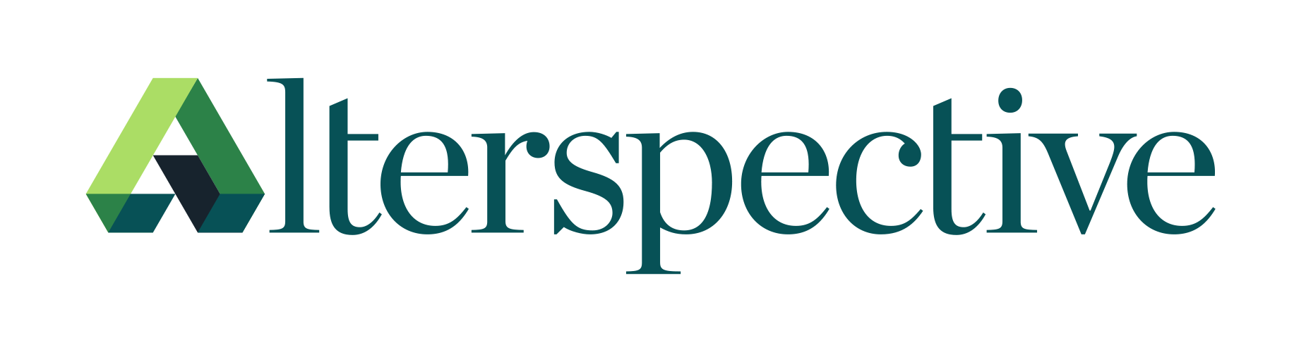
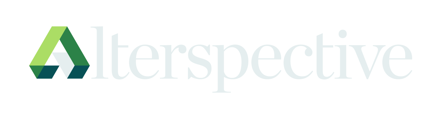


Logo Usage Guidelines
Correct: Left aligned
Incorrect: Centered
Correct: Reversed on dark
✗ WRONG: Shadow/filter effect violates LOGO-002
Logo Clear Space
Always maintain clear space around the logo equal to the height of the "A" in Alterspective. This ensures the logo remains prominent and uncluttered.
Clear Space Rules
- Minimum clear space: Height of the "A" character on all sides
- Preferred clear space: 1.5x the "A" height for premium applications
- Digital minimum: 16px clear space at minimum logo size (120px)
- Never: Place text, graphics, or other elements within the clear zone
Correct: Adequate clear space
Incorrect: Elements in clear zone
Icons
Icon Style Rule
-
ICON-001Icons must be outlined style only, NEVER filled
Brand Icons
Official Alterspective brand icons representing key concepts. All icons use outlined style with 1.5px stroke.
.svg)
.svg)
.svg)
.svg)
.svg)
.svg)
.svg)
Icon Guidelines
Navigation
Arrow, chevron, menu, close icons
Style: Outlined, 1.5px stroke Actions
Add, edit, delete, save, share icons
Style: Outlined, 1.5px stroke Status
Success, warning, error, info icons
Style: Outlined, 1.5px stroke Social
LinkedIn, Twitter, GitHub, email icons
Style: Outlined, 1.5px stroke Correct vs Incorrect Icon Styles
Correct: Outlined
Incorrect: Filled
Patterns
Use these patterns as subtle backgrounds with 10-50% opacity.
Marine Pattern
Marine (#075156) lines on Navy background
Green Pattern
Green (#2C8248) lines on Navy background
Citrus Pattern
Citrus (#ABDD65) lines on Navy background
White Pattern
White lines on Marine/Navy background
Navy Pattern
Navy (#17232D) lines on White/Pale Blue
Perspective Patterns
The "A" perspective mark can be used as a decorative anchor element for layouts and compositions.

Anchor Left Pattern
The "A" mark positioned for left-side anchoring

Anchor Right Pattern
Inverted "A" mark positioned for right-side anchoring

Perspective Base Pattern
Full perspective "A" mark for flexible placement
Documents
Official brand documentation and guidelines.
Visual Identity Guidelines
Complete brand guidelines including logo usage, color specifications, typography rules, icons, and layout examples.
Fonts
Download the official brand fonts. For detailed typography guidelines, installation instructions, and usage rules, see the Typography page.
Need more information?
Visit the Typography page for:
- Why we chose these fonts
- Installation guides for Mac and Windows
- CSS implementation examples
- Typography scale reference
- Typography rules (TYPO-001, TYPO-002, TYPO-003)
Favicons & App Icons
Use the Alterspective symbol for favicons, app icons, and small-format applications. Always use the simplified symbol, not the full logo.
Web Favicons
favicon-16x16.png favicon-32x32.png favicon.ico <!-- HTML head -->
<link rel="icon" type="image/png" sizes="32x32" href="/favicon-32x32.png">
<link rel="icon" type="image/png" sizes="16x16" href="/favicon-16x16.png">Apple Touch Icons
apple-touch-icon.png Use white background (#FFFFFF) with symbol centered at 80% of container width.
<!-- HTML head -->
<link rel="apple-touch-icon" sizes="180x180" href="/apple-touch-icon.png">
Android/PWA Icons
// manifest.json
{
  "icons": [
    { "src": "/icon-192.png", "sizes": "192x192", "type": "image/png" },
    { "src": "/icon-512.png", "sizes": "512x512", "type": "image/png" }
  ]
}
Social Media
<!-- HTML head -->
<meta property="og:image" content="/og-image.png">
<meta name="twitter:image" content="/twitter-card.png">
Favicon Guidelines
- Always use the symbol (not full logo) for icons under 64px
- Background: White (#FFFFFF) for light contexts, Navy (#17232D) for dark
- Padding: Symbol should occupy 70-80% of the icon area
- Never: Add effects, shadows, or rounded corners to the symbol itself
- PWA maskable icons: Add extra 10% padding for safe area
Download Full Asset Pack
Get all brand assets in one comprehensive package including logos, icons, patterns, fonts, Visual Identity Guidelines PDF, and usage documentation.